Opening
Storytelling is proved to be the most powerful way for influencing. The key to success for a storytelling is Effectiveness. As management consultants, you all have done tons of effective storytelling with visual aids of PowerPoint or Keynote slides. However, in this world, there are some slides maybe not that effective. Let’s look at some of them.
When it comes to employing visualization for storytelling, there are some design principles. Today we’re going to dive into the design principles and to see how to think like a designer when storytelling with data visualization.
Before jumping into today’s topic, let’s set a context with 2 “Why”s.
Why “with data”?
The answer is as simply as it’s because data storytelling is the best way to influence and to earn trust.
Data is everywhere. Now, more and more organizations have transit from experience-driven decision-making to data-driven decision-making. They start from data, identify patterns, draw insights, and then take actions. This approach of decision-making is more informed, effective, and efficient.
Also, data will make your story sounds more credible and it’s easier to earn trust from audience.
Why “visualization”?
Visualization is using visual elements such as color, graph, or image to present data, to tell the story behind data and to provide insights. The effect of visualization is.
- It’s easier to understand.
- It’s easier to have the message stick with our audience.
Do you have such experience? you have read many books when you were a kid and you still have some pictures in your mind about the time when you were reading, room setting, the furniture, the sunshine going through the windows, the snack or drink at your hands, but nothing about the books.
Social researchers found that the written-word text goes into our short-term memory where we can retain around 7 bits of information, whereas visuals go straight into our long-term memory where they are indelibly etched. 90% of information transmitted to the brain is VISUAL. The process is faster. Visuals are processed 60,000 times faster in the brain than text.
There was a study even found that human can successfully remember details about thousands of images after only a single viewing.
This is why images can help us more quickly recall things stored in our long-term memory.
How “storytelling”? Think like a designer.
When it comes to visualization, one word might be thought of immediately, aesthetics.
Make it pretty? Yes. Why not! Given the quality of the data is nothing doubtful, aesthetics is the evidence of profession. Considerations for aesthetical pleasent, such as avoid rainbow color, be patient with alignment, be careful of details, show a respect for your work and your audience. However, data quality is the first place. If the data is not credible, any reports on top of that will be garbage. That’s how people say, garbage in, garbage out.
Think like a designer, is under the assumption that the data quality is ensured.
Space
When think like a designer, the first thing you need to consider is Space. Space planning is the foundation of all design ideas.
Space planning refers to how much space you want to implement, where you wish to allocate the content including text, charts, titles, etc.
When it comes to storytelling, time is the space, your PowerPoint slide, or any other reporting tool, is the space. We often hear people say, “I run out of time.” or “I run out of space.” That’s evidence of lack of space planning.
What to do? Think about the desired outcome before you start is crucial.
Let me give you an example. In order to find two pearls, you might have to open 100 oysters, same as look at the data/information in 100 different ways. These two pearls are the specific stories you want to tell. Will you find the 2 pearls to provide to audience or give them 100 oysters to find the pearls by themselves? It can be tempting to show the audience everything, as evidence of all the hard work and the robustness of the analysis. This way, you’re forcing your audience to reopen the 100 oysters themselves. This is risky. What if they lose their patience? What if they opened all in a wrong way which totally out of your control and finally find nothing? Just focus on the 2 pearls, which is the information your audience needs to know.
However different audience has different interests of pearls. Just like the challenges I’m facing currently.
The consumers of the reports vary from C-suite management to domain experts such as business line managers and business analysts. They have various interests that will be draw from the reports. Managers and business analysts usually like to dig into details and sometimes stick-on methodology and calculation logic. While C-suite management mostly care about the big picture and want to see trends, pattern quickly to support their business decisions. They have different interest of pearls.
What to do? Ask yourself questions. Who is my audience? What I want my audience to know or to do? What would the success look like? What are they interested in the most? What’s the relationship between the audience and me? Do they already trust me as an expert, or do I need to work to establish credibility?
By answering these questions, you narrow your target audience, tailor your content to meet their specific needs and provide them their loved pearls. That will be an effective and successful storytelling. In Power BI reports, I need to consider different interests and put them together. Sometime by drilling down and up to show different granularity of data, sometimes by combining trend and detailed numbers together, I need to put together the innumerous, detailed and sometimes complicated data into reports to satisfy both managements and domain experts.
Contrast
Contrast happens when two elements are in opposition to each other, like black and white, horizontal and vertical, etc. High contrast is an attention grabber. It can help guide the audience’s eyes to the most important parts of your story first.
Strategic use of contrast is important in visualization because it enables us to direct our audience’s attention towards the most important information in our visual.
You may say, obvious contrast isn’t easy to be seen. Here is the trick. When creating contrast by putting differences in patterns, our brains will immediately realize these differences. This is called pre-attentive processing. Now let’s look at those patterns and see how quickly you can find the differences.
Utilizing this principle to create clear contrast and provide a signal to our audience, helping them understand where to focus their attention.
Color
Color plays an important role in visualization, because our brains are better at identifying color rather than shapes.
Color affects the mood. It’s a powerful design principle because it helps you communicate on an emotional and subconscious level.
For instance, blue tends to make people feel calm or trusting, while red can help rile up emotions and get people to take actions. It’s why stop signs—and often, buy buttons in web designs—tend to be red.
However, when the audience is from an organization and the organization has its own brand colors, in storytelling, we don’t consider colors as a language for emotion. It’s a good idea to leverage the brand colors to build the alignment with the audience who come from the organization. For example, who knows ProjectAdvisor’s brand color? That’s why I’m using this orange color. In our reports for Tricon, you also can see this alignment.
There are 2 tips: use colors sparingly and maintain consistency. Color should be used sparingly. Too many colors prevent anything from standing out. Do you remember we talked about creating contrast to draw your audience’s attention? Variety increases, which means lack of clear contrast, can be a form of visual clutter. Let’s borrow the famous analogy of Colin Ware: “It is easy to spot a single hawk in a sky full of pigeons, but if the sky contains a greater variety of birds, the hawk will be more difficult to see.”
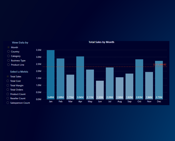
Also, we need to maintain consistency when using colors. Do you think it makes sense to change the colors or graph types so the audience doesn’t get bored? The answer is, NO. What shouldn’t be boring for your audience? Your story, not visualization. So when you are showing similar information, try to use the same type of graphs and same color scheme. Your audience will be quickly trained how to read the information, making the interpretation of all the visuals much easier and reducing their mental fatigue.
Alignment
There is one single change that has the biggest impact in the visualization, named alignment. This will give you the greatest impact with the least effort.
There are two benefits. One, it helps ensure a sharp, ordered appearance. Two, it ensures the various elements have a pleasing connection with each other. In general, the goal is to create clean lines (both horizontally and vertically) of elements and white space.
White space
White space is not necessarily “white”. It can be any color the same as the background on your visualizations. White space in visual communication is as important as pauses in public speaking, or as common in writing. It gives the audience room for breathing and rests for the eye. If there is no white space, the visualization may seem crowded or claustrophobic, and will make your audience uncomfortable. Audience discomfort in response to the design of our visual communication is something we should aim to avoid.
However, too much white space can make the visualization look unfinished or something missing.

Illustration: Golden Ratio
Golden Ratio
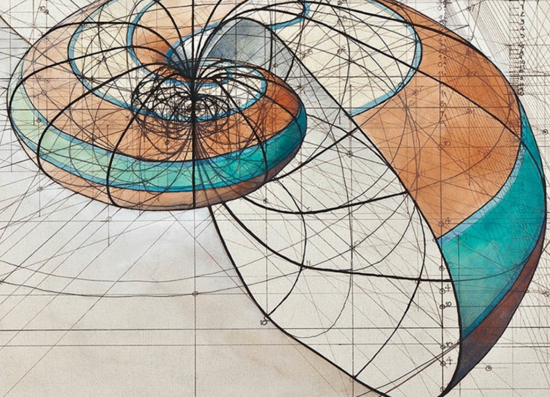
Many people, including designers and photographers, use a strategy called Golden Ratio. Using your imagination to divide your work area into a 3×3 grid.
We can see no matter an architecture, a statue, a flower, or a photo, if it’s visually appealing, usually it follows the Golden Ratio rule. When it comes to data visualization, it’s the same.
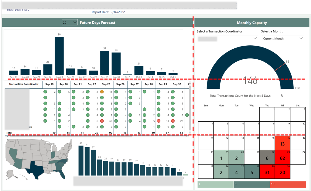
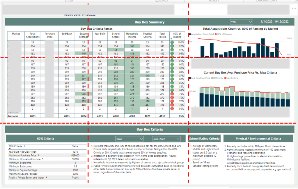
Example: These reports are designed to follow the Golden Ratio rule.
In closing
In conclusion, think like a designer is an effective way when it comes to storytelling with data visualization.
Today we talked about 6 design principles and practiced how to apply those principles to create a more effective and visually appealing visuals.
When I was in university, sometimes we needed to submit our work using PowerPoint. No one knew how McKinsey’s PowerPoint templates became so popular. I used to dig into the two hundreds of pages of templates and tried to “steal” some for my work, but nothing turned out to be great. I gradually realized that, there is no templated from other will fit my story. It’s my story and I have to design it from scratch, using some design principles. This way, my storytelling with data visualization can turn my PowerPoint into powerful point. I believe, it also works for you.

