
Requirements:
In some situation, business user particularly like a card to display a number of KPI, such as Total Sales, Average Sales per Product, etc. It’s especially common on the summary page, where user prefer to see the numbers directly instead of drill down or drill up to find out details.
Solution:
This requirement can be achieved by today’s KPI visualization: Gauge + Card + customized arrows.
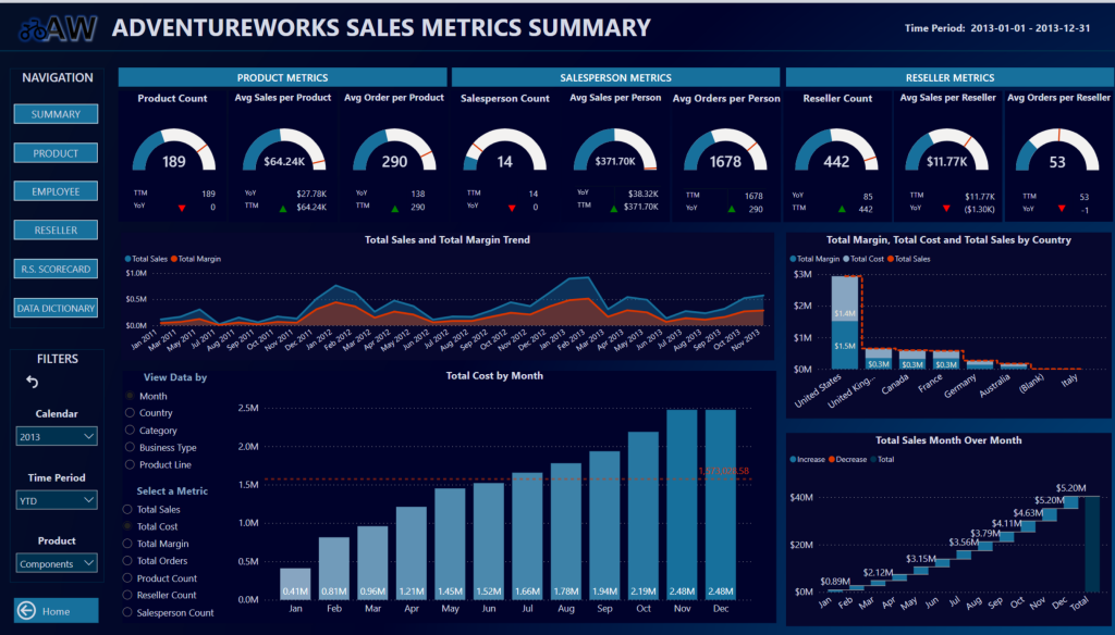
The result will look like this:
Steps:
- Create the measures for Gauge visuals:
Product Count = DISTINCTCOUNT( ‘Product'[Product Key] )
-
Create Gauge visuals.
- Decide the Maximum and Target for each KPI. Target should be based on the company goals, the market trend, etc. It should be a case-by-case discussion with business. In this example, let’s pretend the target of product is the doubled all-time product count. For Maximum, the celling to the company’s capacity, which should be greater than the target, we set it as the target plus 100.
- Create a Calculation Group in Tabular Editor. With Calculation Group, we can dynamically apply the maximum and target calculation on base measures. In this example, we create the target in Calculation Group and then use it as a filter in the Calculated Measures, assuming different KPI has different logic for deciding Maximum.
Calculation Items:
Keeping Target = SELECTEDMEASURE ()
Increasing Target =SELECTEDMEASURE () * 2
Calculated Measures:
Product Count Target =
CALCULATE(
[Product Count],
‘Short-Term Goals'[Name] = “Increasing Target”
)
Product Count Max =
CALCULATE(
[Product Count],
‘Short-Term Goals'[Name] = “Increasing Target”
) + 100
You can create a Time Intelligence calculation with Calculated Measures as well. I prefer Calculation Group technique because usually there will be the same YoY calculation for many base measures. With only one Calculation Item, we save the redundant work and reduce the number of measures.
- Create Card visual to pronounce the actual numbers aloud.
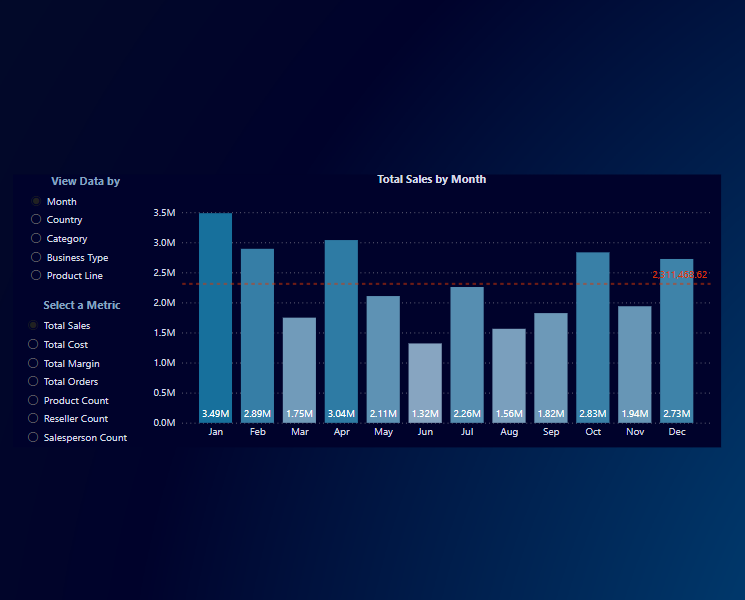
Decide the time period for the numbers. In this example, we display TTM (Trialing Twelve Months) and YoY (Year Over Year).
For this purpose, we need to create another Calculation Group in Tabular Editor, Time Period Calculation.
All Time = SELECTEDMEASURE ()
TTM = CALCULATE ( SELECTEDMEASURE (), DATESINPERIOD ( ‘Date Table'[Date], MAX ( ‘Date Table'[Date] ), -1, YEAR ))
YoY =
VAR _currentYear = SELECTEDMEASURE()
VAR _previousYear = CALCULATE ( SELECTEDMEASURE(), SAMEPERIODLASTYEAR( ‘Date Table'[Date] ) )
VAR Result = _currentYear – _previousYear
RETURN
Result + 0
For the YoY,
- Create the arrows based on YoY.
- Create the YoY measure:
We use the Calculate Item YoY as a filter to create a calculate measure:
Product Count YoY =
CALCULATE(
[Product Count],
‘Time Period Group'[Name] = “YoY”
)
- Create two measures for arrows, one for icon and the other for color.
Arrow Product Icon =
VAR PositiveIcon = UNICHAR( 9650 )
VAR NegativeIcon = UNICHAR( 9660 )
VAR Result =
IF(
[Product Count YoY] > 0,
PositiveIcon,
NegativeIcon
)
RETURN
Result
Arrow Product Color =
IF(
[Product Count YoY] > 0,
“Green”,
“Red”
)
Select a Card visual and put “Arrow Product Icon” in it. It will show a black up/down arrow.
Now, conditionally format the Card visual by setting Callout Value color as based on Field Value – Arrow Product Color.
Now, arrange the Gauge visual, Card visual and arrows. We have a beautiful and powerful KPI visual.