One beauty of Power BI is the capability of being dynamic. With Power BI Desktop, there are many functionalities that can enable the dynamic report visualization, such as Slicer visual, Drill Down or Up in Matrix visual and such. It provides answers only based on users’ questions by their actions on the report, rather than displays all data statically in front of the users regardless of what they’re interested in. Dynamics means saving the precious real estate on a report canvas, especially in a summary level report, and also results a greater level of interestingness and engagingness to the users.
Field Parameter and Switch Measure are some of the techniques that enable the dynamics. The combination of the two can be even more powerful and can create an app-like feeling.
Today let’s jump into this technique to create a dynamic summary visualization.
Requirement:
In the AdventureWorks sales report, there are 7 metrics, Total Sales, Total Cost, Total Margin, Total Orders, Product Count, Reseller Count, and Salesperson Count. On the summary page, users want to view all the 7 metrics from different angles, Month, Country, Category, Business Type, and Product Line.
How to display all the information in one visual so to make the report more engaging and enjoyable, while saving space? Field Parameter + Switch Measure can help to achieve this goal.
Solution:
Now let’s create it step by step:
- Relationship

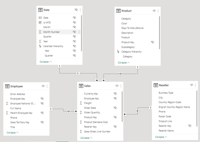
Screenshot of the data model
Notice there are two relationships are set to Both, Sales and Product, and Sales and Employee. This is to enable the filter can propagate from Date – Sales – Product / Employee when we filter Product Count and Salesperson Count by Month.


- Base measures
Total Sales = SUM( Sales[Total Sales] )

Total Cost = SUMX( Sales, Sales[Product Standard Cost] + Sales[Tax Amt] + Sales[Freight] )

Total Margin = [Total Sales] - [Total Cost]

Total Orders = SUM( Sales[Order Quantity] )

Product Count = DISTINCTCOUNT( 'Product'[Product Key] )

Reseller Count = DISTINCTCOUNT( Reseller[Reseller Key] )

Salesperson Count = COUNT( Employee[Employee Key] )
- Switch Measure
- Disconnected table

This is how the data model looks like now.

Screenshot of data model
- Switch measure
Switch Measure Totals =

IF(

HASONEVALUE( 'Switch Measure'[Metrics] ),

SWITCH(

VALUES( 'Switch Measure'[Metrics] ),

"Total Sales", [Total Sales],

"Total Cost", [Total Cost],

"Total Margin", [Total Margin],

"Total Orders", [Total Order Quantity],

"Product Count", [Product Count],

"Reseller Count", [Reseller Count],

"Salesperson Count", [Salesperson Count]

),

[Total Sales]

)
No formatting, no DAX. This is a great example to tell us this truth.
- Field parameter
How to create a Field Parameter is here.
Totals Parameter = {

("Month", NAMEOF('Date Table'[Calendar Month]), 0),

("Country", NAMEOF( 'Sales Territory'[Country] ), 1),

("Category", NAMEOF('Product'[Category]), 2),

("Business Type", NAMEOF('Reseller'[Business Type]), 3),

("Product Line", NAMEOF('Reseller'[Product Line]), 4)

}
Remember, you can always change the fields by adjusting this code.
- Visualization

Now it’s time to be creative. Let’s create three visuals, a Slicer for the Field Parameter, another Slicer for the Switch Measure and a Column chart for displaying the data.
Field Parameter slicer usually is default when you create the Field Parameter in Modeling if you select “Add slicer to this page”.

Switch Measure slicer is for the “metrics” list in the Switch Measure table we created in the 3.1 step.

Column chart uses the Field Parameter as x-axis and the Switch Measure we created in the 3.2 step as y-axis.

Then give it proper formatting and grouping visuals.
Now you have a highly dynamic summary visual for your summary report.


